Client name and internal details abstracted due to NDA

Enterprise Sales Operations & Performance System

Designing a multi-role enterprise web system that helped regional managers review activity faster, approve work
at scale, and trust operational data.

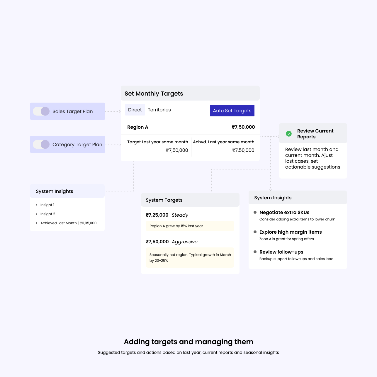
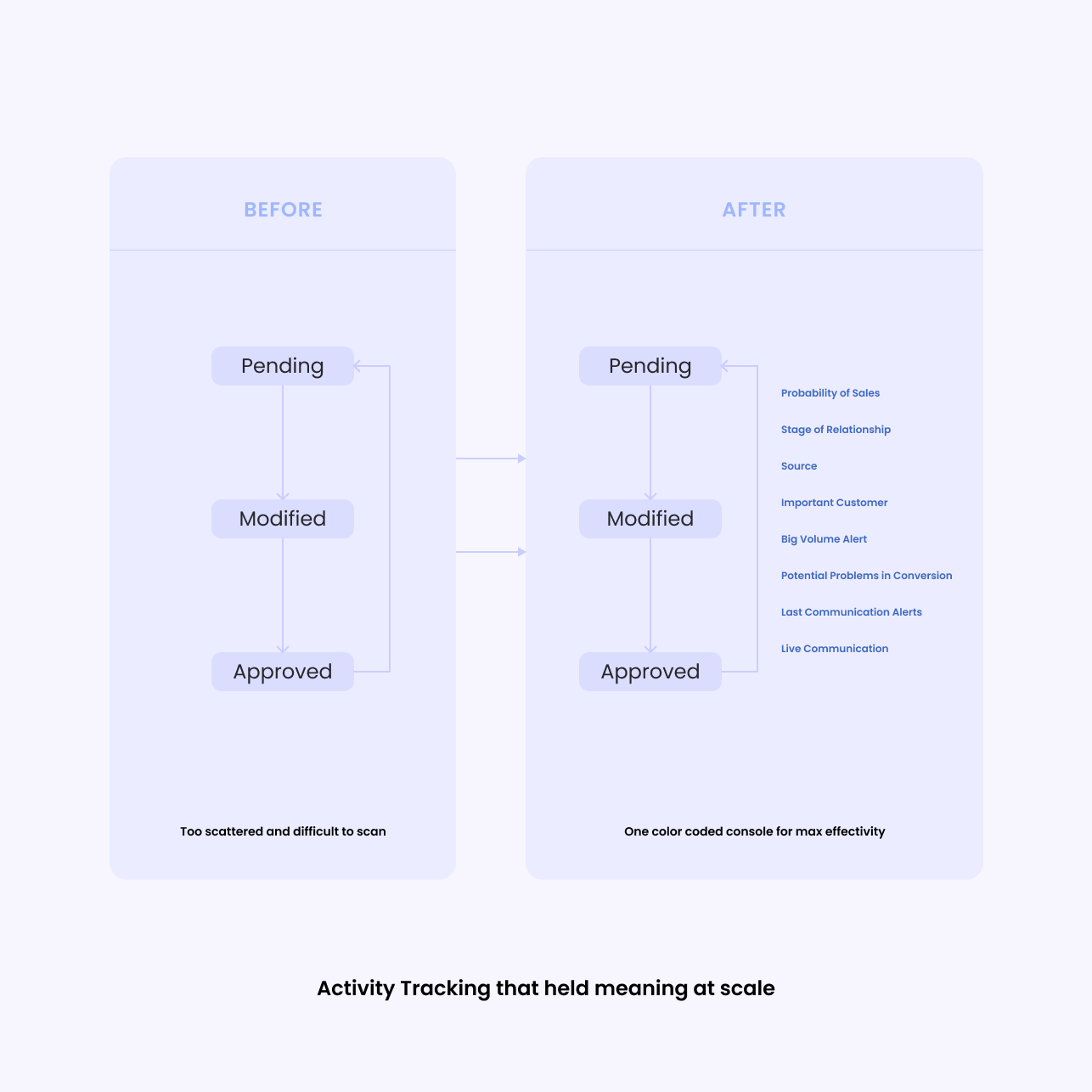
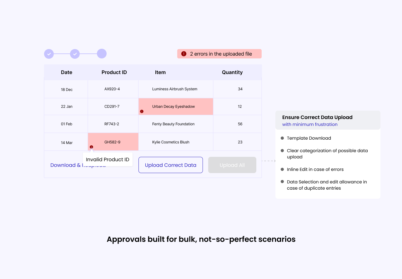
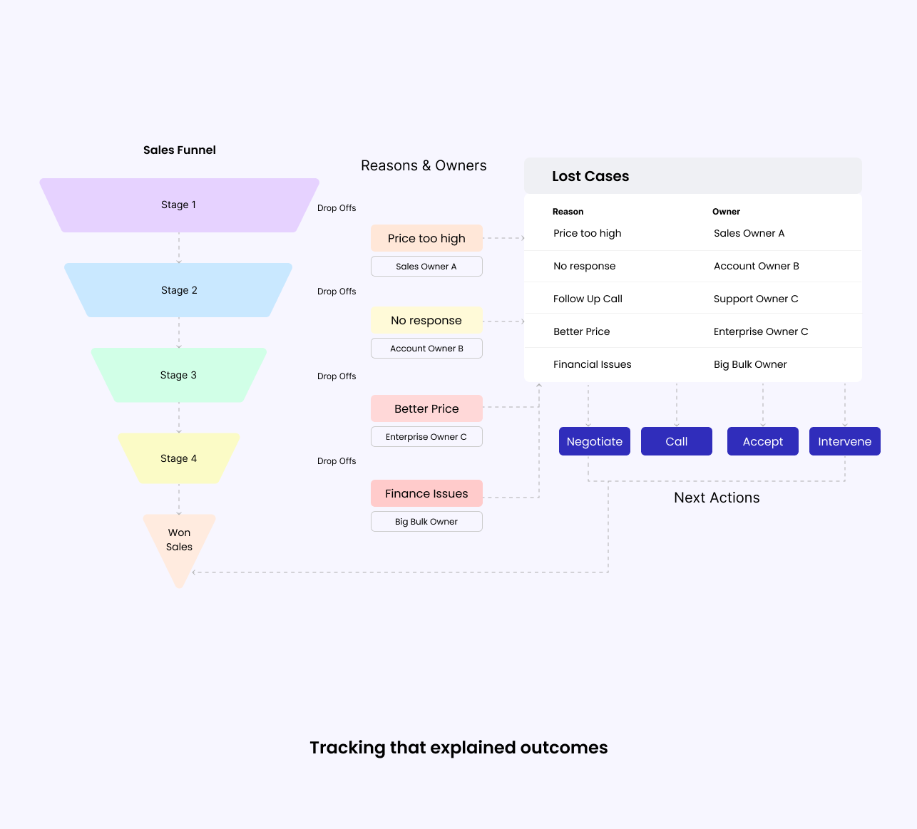
Sales managers were responsible for reviewing daily field activity across regions using fragmented internal tools.
As activity volume increased, the system failed to scale with their workflows — slowing reviews, approvals, and decision-making.

This project focused on redesigning core workflows so the system could support scale without breaking clarity, trust, or speed.

Role
UX Designer
Platform

Internal Enterprise Web Application

Users

Sales Managers , Sales Executives , Regional Managers, Leadership

Context

High-frequency sales operations, deep data, financial accountability

My role & ownership

I worked as a UX Designer focused on core sales workflows inside an existing, legacy enterprise platform. My responsibility was to:

  • identify where the system broke under real, high-volume usage
  • redesign workflows so they could actually be used day-to-day
  • balance user needs with strict backend, business, and IT constraints

I worked closely with:

  • product owners
  • business stakeholders
  • engineering teams
  • sales managers and end users

This project included:

  • user interviews
  • digital user testing
  • iterative feedback loops with real users

Why this project mattered?

This system was the backbone of daily sales operations for a large, distributed sales organisation. It was used to:

  • log daily sales activity
  • review pipeline health
  • approve outcomes
  • track performance across regions and roles

On paper, the system worked. In practice, people didn’t trust it. As data volume and business complexity grew:

  • sales activity spilled into Excel and offline notes
  • managers cross-checked data outside the system
  • approvals slowed down
  • reports were questioned instead of relied on

The problem wasn’t missing features. The problem was that the system became harder to reason about as it scaled. This project was about restoring clarity, accountability, and trust inside a complex enterprise tool — not adding more functionality.

At scale, UX failures are usually systems failures. 

This project focused on fixing those failures.

As daily activity volume increased, small inefficiencies in tracking, review, and approvals slowly added up to real operational friction.

The challenge here wasn’t adding more features.
It was figuring out how to design workflows that could hold up under scale — across roles, deep data, and constant time pressure — without losing context, accountability, or trust.

Scale
Bulk decisions
Data trust
Role-aware visibility
Operational continuity

The system didn’t lack features. It lost meaning as the data piled up. States blurred together. Ownership felt fuzzy. Next steps weren’t obvious. Approvals turned into manual detective work. Lost cases had no story. Funnels gave numbers but zero insight into causes. And trust? It just quietly drained away. Users don’t file complaints—they just stop relying on the tool and build their own fixes.

There was real push to simplify hard: collapse states, auto-resolve stuff, hide complexity. But that would’ve buried responsibility, made errors tougher to trace, and killed trust even more. We pushed back and chose clarity over quick minimalism—even if it meant more explicit states, visible checks, and a bit denser UI. That one call shaped pretty much everything we built.

Targets grounded in real performance

Multiple targets were being set without proper evidence to rely on, making goals either unrealistic or overly conservative.

Monthly targets were being set manually across two plans, often ignoring seasonality, regional context, and past performance. Managers relied on gut feel or spreadsheets, leading to targets that were either too safe or unrealistically aggressive.

We redesigned target setting as a guided flow. The system could auto-suggest targets using last year’s data, seasonal trends, and regional patterns, while still allowing managers to review current vs previous performance, adjust assumptions, and renegotiate with context.

Designing within real constraints
Target-setting time dropped, debates reduced, and teams aligned faster on achievable goals—shifting focus from arguing numbers to improving outcomes.

Activity tracking that actually held meaning at scale

States like “Pending,” “Modified,” and “Approved” started feeling interchangeable when you’re staring at hundreds of entries. Managers ended up verifying everything from memory or spreadsheets.

So we made states mutually exclusive and easy to reason about, with clear ownership and next actions—no sneaky inferred logic that hid accountability.

Why it mattered
Clear states cut doubt early. No more manual double-checks before even starting.

Approvals built for bulk, not perfect scenarios and validations that didn't lie success.

One-by-one approvals crumbled under cognitive load—context disappeared between clicks, reviews got delayed or moved offline. Silent failures, partial uploads creating false confidence, errors popping up too late.

Bulk flows with inline context, quick approve/reject/modify, and visual cues for what really needed eyes. Validation-first flows, clear inline errors with fix paths—no green “success” unless data was actually clean.

Trade-off
Denser UI, but decisions got faster and more reliable. We owned that choice.

Why it mattered
Visible errors beat hidden ones every time. Trust rebuilds faster when the system is honest.

Lost cases, funnels, and lead tracking that actually explained outcomes

Lost cases were just lists. Funnels showed drops but no “why.” Leads weren’t traceable in a way that matched real sales life.

Grouped lost cases by reason/status/owner, tied funnels to actual actions, and aligned tracking to how sales really happens—not some idealized version.

Why it mattered
Managers went from “What happened?” to “What do we do next?”—that shift felt huge.

User testing & validation

Tested with 18 real users (12 managers, 6 TSMs) via digital sessions and interviews.

What improved:

  • Review confidence jumped noticeably.
  • Excel dependency dropped hard.
  • Daily reviews got meaningfully faster.

No more Excel pivots every morning

RakeshRegional Manager

Pipeline summary actually helps now.

Bilauri LalLead

First time our inputs were heard and implemented.

MohanSales Head

Outcomes

Faster, more trusted daily reviews.
Way less manual cross-checking.
Sharp drop in parallel Excel usage.
Scaled cleanly for all activities.
Won the Super Squad Award for cross-functional impact.

This project fundamentally changed how I think about UX in complex, high-pressure environments. Usability often breaks long before the interface itself does—it fails when people are forced to compensate for ambiguity with memory, spreadsheets, or workarounds. My role wasn’t to chase visual simplicity or make everything prettier; it was to be intentional and sometimes ruthless about where clarity mattered more than minimalism, building flows that could hold trust even under constant strain. Good enterprise UX doesn’t demand attention—it’s quietly effective because it removes the need for second-guessing.

More detailed flows, trade-offs, and rationale can be discussed during interviews.

Full case study available on request (NDA-bound).