Client name and internal details abstracted due to NDA
Learning Management System
for Student, Parent, Teacher and Admin across schools and coaching
Designing and shipping a multi-role education platform under real-world constraints.
Sole Product Designer
Platform
Android apps (Student, Parent, Faculty, Management)
Users
Value-driven, repeat commerce users
Context
Tier 2 / Tier 3 schools, mixed digital literacy, Hindi & English medium
Designing clarity for high-speed commerce.
AFPMS is a role-based school management platform used by teachers, parents, students, and administrators — often in time-constrained, low-tech, and high-accountability environments. As the product expanded from coaching institutes to full-scale schools, complexity grew rapidly. Features multiplied, stakeholders diversified, and expectations rose. The challenge wasn’t access to information — it was making academic progress, responsibility, and next steps immediately understandable for every role, without increasing cognitive load.
Fragmented Workflows
Admin Overload
Context Loss
Cognitive Fatigue
Trust Through Structure
My role & ownership
I was the only UX & UI designer on AFPMS. I owned:
- end-to-end UX and UI across four role-based apps.
- information architecture and navigation
- interaction patterns for high-density features
- visual language
- component decisions continuous iteration post-launch
There was no formal primary research due to timelines and team size. Design decisions were informed by: deep competitor benchmarking founders’ 12+ years of coaching/LMS experience real-time feedback from early school users constant iteration based on what broke or confused users This was a fast-moving, constraint-heavy product.
Why this project mattered?
School systems are complex, fragmented, and deeply human. Teachers are overloaded with admin. Parents want transparency but lack time. Students need structure without pressure. School leaders need visibility without micromanagement. Most school apps either: solve only communication, or digitize admin without improving experience. AFPMS started as a coaching-focused LMS, but mid-way, the founders decided to pivot it into a full-fledged school management system. I joined as the sole designer at this inflection point — when the product direction, user base, and expectations were all changing at once.
How do you design a single system that serves four very different user groups — with very different needs, digital comfort levels, and authority — without overwhelming any of them?
How I Approached the Problem
How might we design one system for four roles — without forcing a shared mental model?
Risk : One-size-fits-all UI would fail instantly.
I designed AFPMS as four distinct role-based experiences, not a single app with permission toggles. Each role sees: only what they need when they need it in language aligned to their daily reality
Why this worked?
The same data served different intents without confusion: teachers executed parents monitored students tracked management oversaw
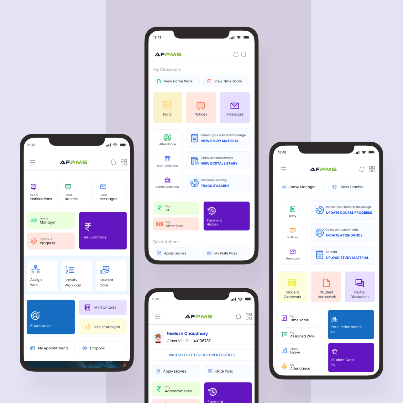
1
Student | consumption actions
2
Parent | monitoring actions
3
Teacher | execution actions
4
Management | oversight actions
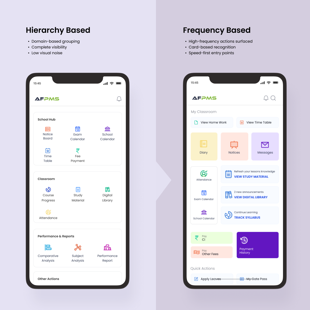
How might we support feature-heavy workflows without creating feature fatigue?
Risk : Turning the app into a cluttered control panel.
Instead of hiding features, I focused on progressive exposure: high-frequency actions surfaced first secondary actions pushed deeper repetition optimized for speed, not novelty Frequency of use became a stronger signal than hierarchy.
Why this worked?
Users stopped hunting for features and started recognizing them.
How might we design for mixed digital literacy without dumbing the product down?
Risk : Oversimplification vs intimidation.
I optimized for clarity over minimalism: pastel, multi-color UI used as a scanning aid navy blue as a grounding primary color used functionally, not decoratively The same visual language was carried across Parent, Teacher, and Management apps to maintain familiarity.
Why this worked?
Even low-tech users could navigate confidently without training.
How might we enable fast, repetitive actions in a dense system?
Risk : Menu fatigue.
Alongside a traditional menu, I introduced a dynamic, PhonePe-style content layout for high-frequency actions. This allowed: faster access to daily tasks visual discovery reduced reliance on memory.
Why this worked?
Users moved from “searching” to “acting”.
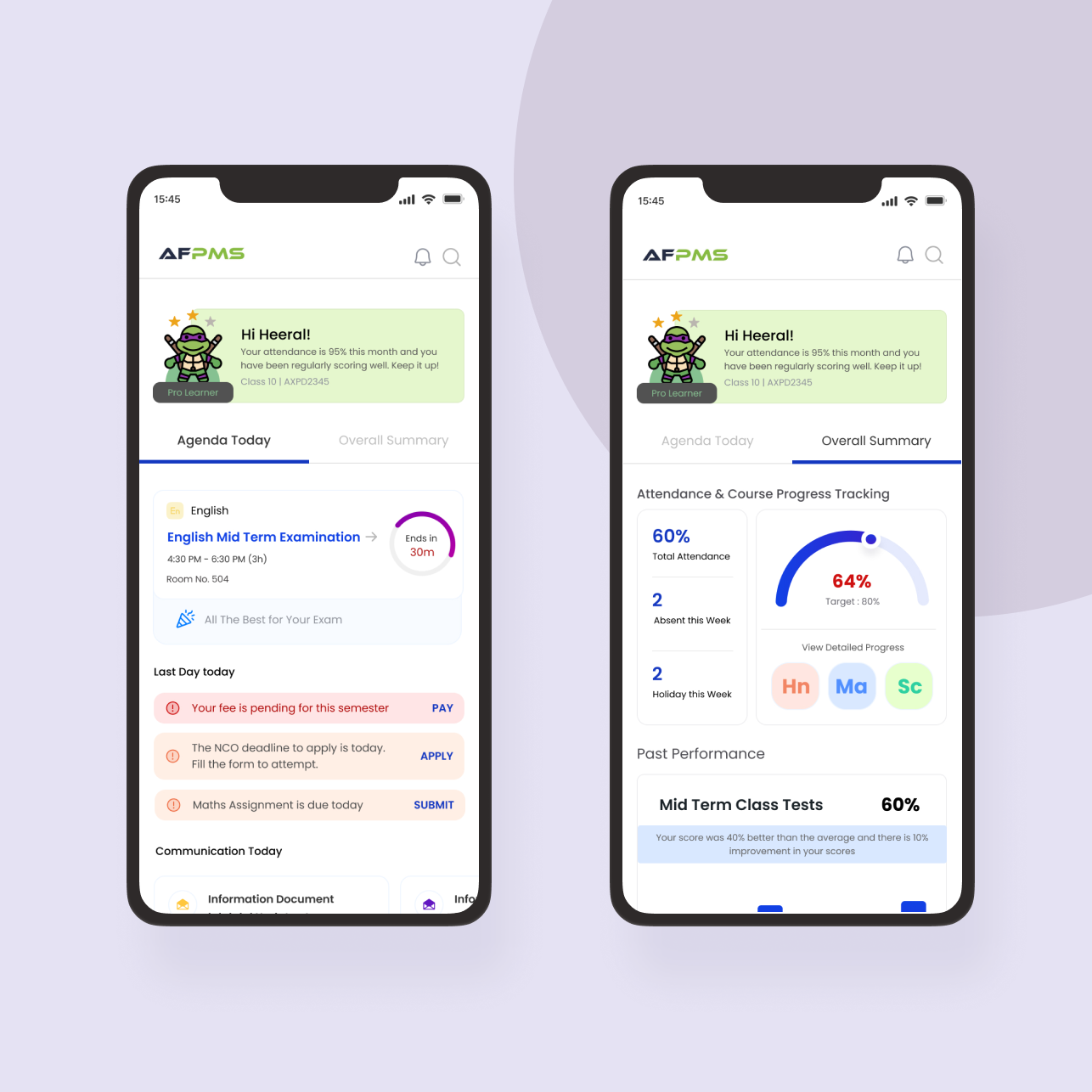
1
Urgent Actions and Deadlines upfront and highlighted for the day
2
Task for the day. Lies at the top in case of exams, when there are classes instead, it gets placed below urgent actions and to-dos.
3
Shows summary of performance, attendance and course progress – based on frequency of usage and offers direct linkage to the desired screen
How might we ship responsibly with limited frontend bandwidth and time?
Risk : Waiting for polish and missing momentum.
I prioritized: interaction clarity over visual perfection aggressive component reuse flows that could survive incremental improvement The product shipped early and improved live.
Why this worked?
Momentum enabled adoption — and iteration followed real usage.
What I designed
(scope, not a feature list)
Across the ecosystem, I designed:
- onboarding and role-based entry flows
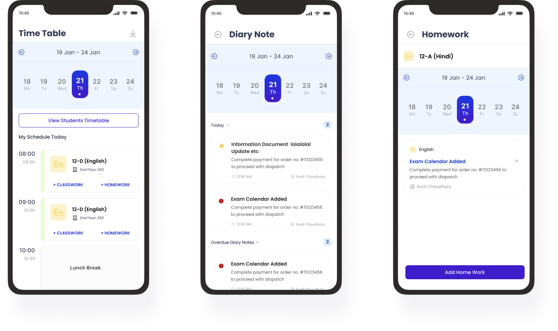
- attendance, homework, syllabus, and exam workflows
- report cards and result analytics views
- fee dashboards and payment journeys communication
- notice systems profile, settings, and access control management
- dashboards and oversight views
All across four apps, balancing consistency with role clarity.
Early Outcomes & impact
Adoption: 1,000+ total downloads
Faculty app: 600+ downloads ~10 schools using AFPMS
daily 2 direct school conversions from product demos
Early NPS: 7.8 / 10
Usability wins: Onboarding completion improved from ~50% (beta) to ~85% Teachers reported ~30% reduction in admin time (5 qualitative surveys)